The Challenge
Jones Deslauriers (Navacord) was growing fast through a series of national acquisitions. They already had an internal design system meant to unify digital touchpoints across 45+ broker partners, the IT had a newly built proprietary system it no longer aligned with product direction, couldn't support the visual variation needed, and had serious accessibility gaps. This design system update it wasn't a nice-to-have; it was an operational imperative.
Role & Scope
As the sole designer on this, with no handoff, I took a broken design system and rebuilt it, starting with a full audit, then moving through token architecture, component development, accessibility documentation, and finally rolling it out across the entire Canada-wide team.
Approach
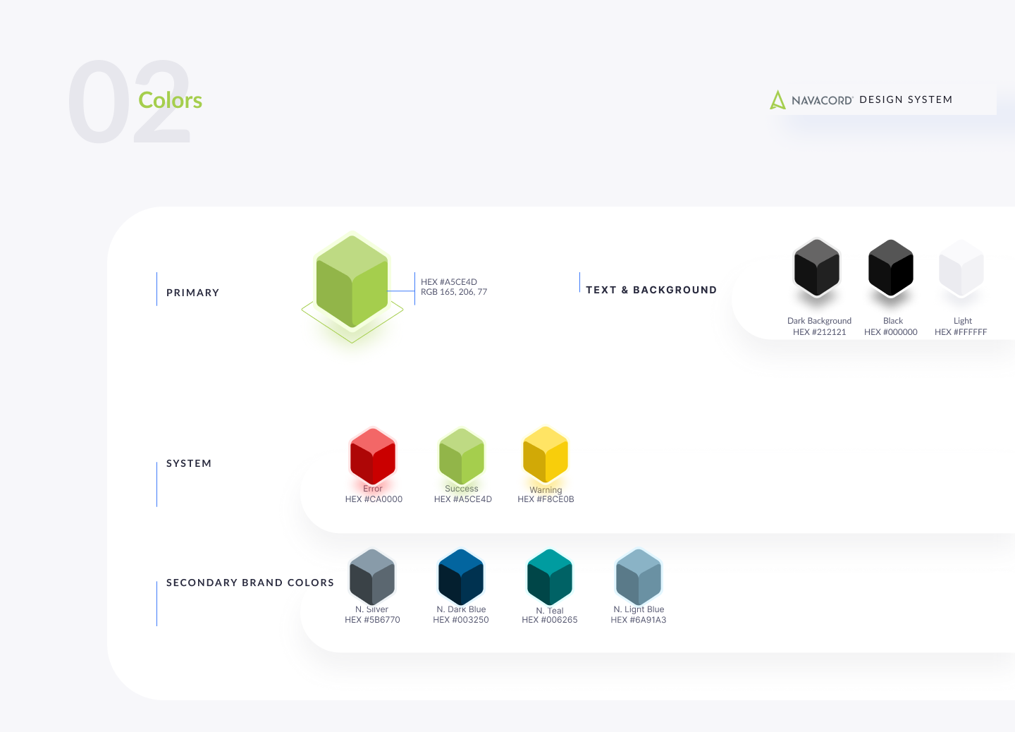
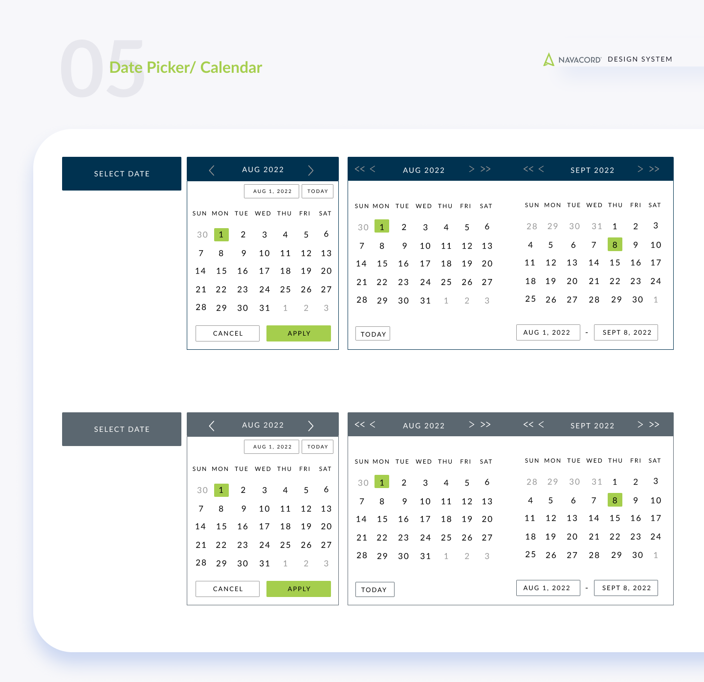
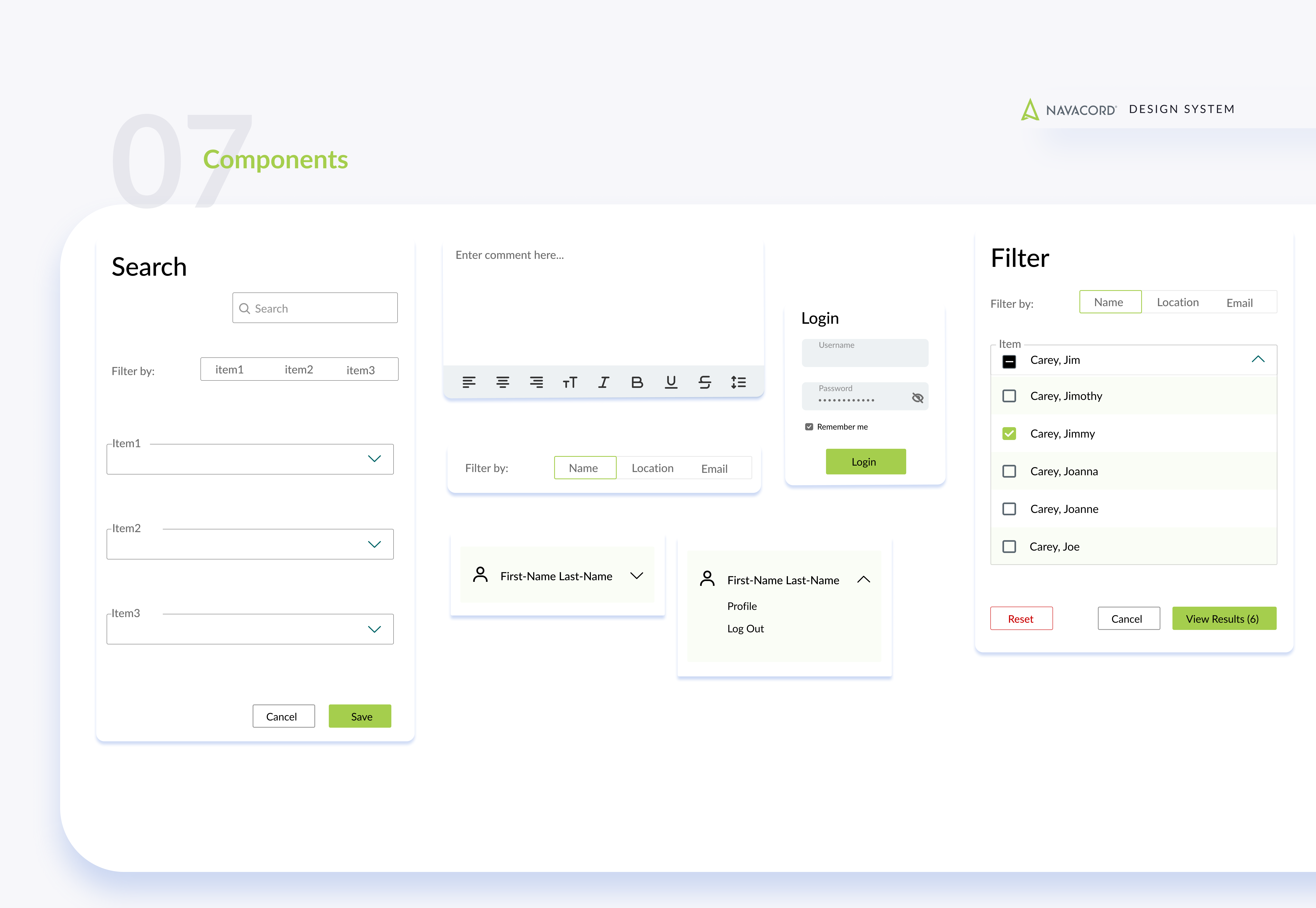
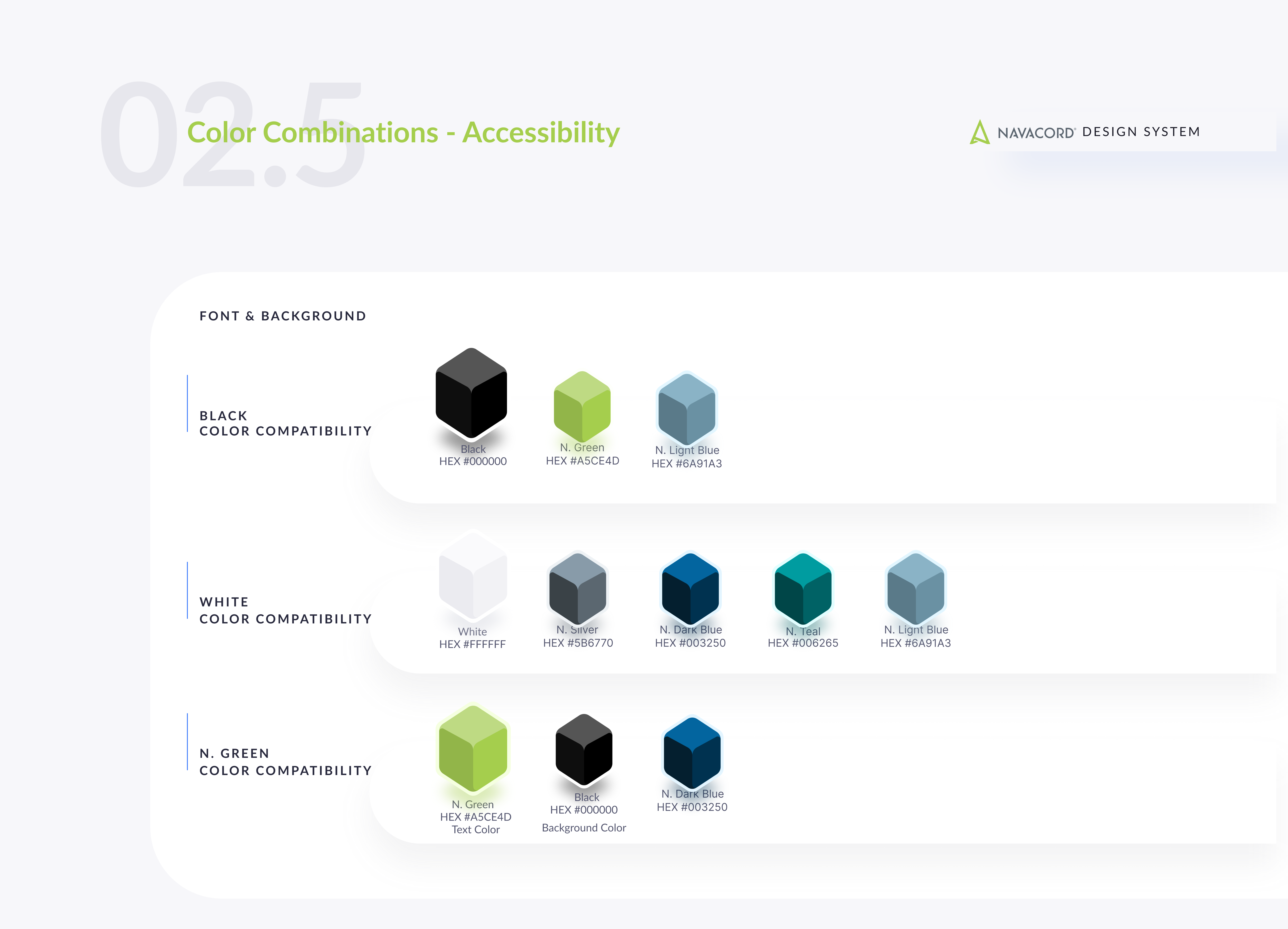
I audited the existing system against real insurance workflows, policy date ranges, client filtering, bulk data tables, rather than generic UI patterns. That inventory became the blueprint: governance model first, then Figma. I built a token architecture with a base layer (spacing, type, grid, system colors) and a semantic layer on top, so each of the 45+ partner brand IT teams could apply their own values without breaking component logic. The semantic color system was designed to strictly separate brand color from state color (error, success, warning), removing any ambiguity in a space where a red state could mean a claims issue. Accessibility (AODA/WCAG) was documented at the component level, not bolted on later. I also ran adoption sessions with non-design stakeholders, IT leads, partner teams, to make sure the system actually got used day-to-day.
Outcome
A single source of truth now governs 45+ broker partner IT products nationally. All touchpoints are AODA/WCAG compliant, built in at the source. We saw a 40% improvement in site load performance. New acquisition partners can onboard without needing a full design rebuild, and non-designer stakeholders can operate independently within the system