The Challenge
Most budgeting apps treat a shared household as a single unit, one login, one view. Which completely misses the reality that two people bring different spending habits, different levels of financial anxiety, and an ongoing need to talk about money without it turning into tension. No mainstream product actually addresses the relational side of managing finances together.
Role & Scope
I handled end-to-end product design for this speculative concept: user flow mapping, UI design, component creation, and an interactive Figma prototype. The goal was to show native mobile product thinking in a space that’s heavily regulated and deeply sensitive to trust.
Approach
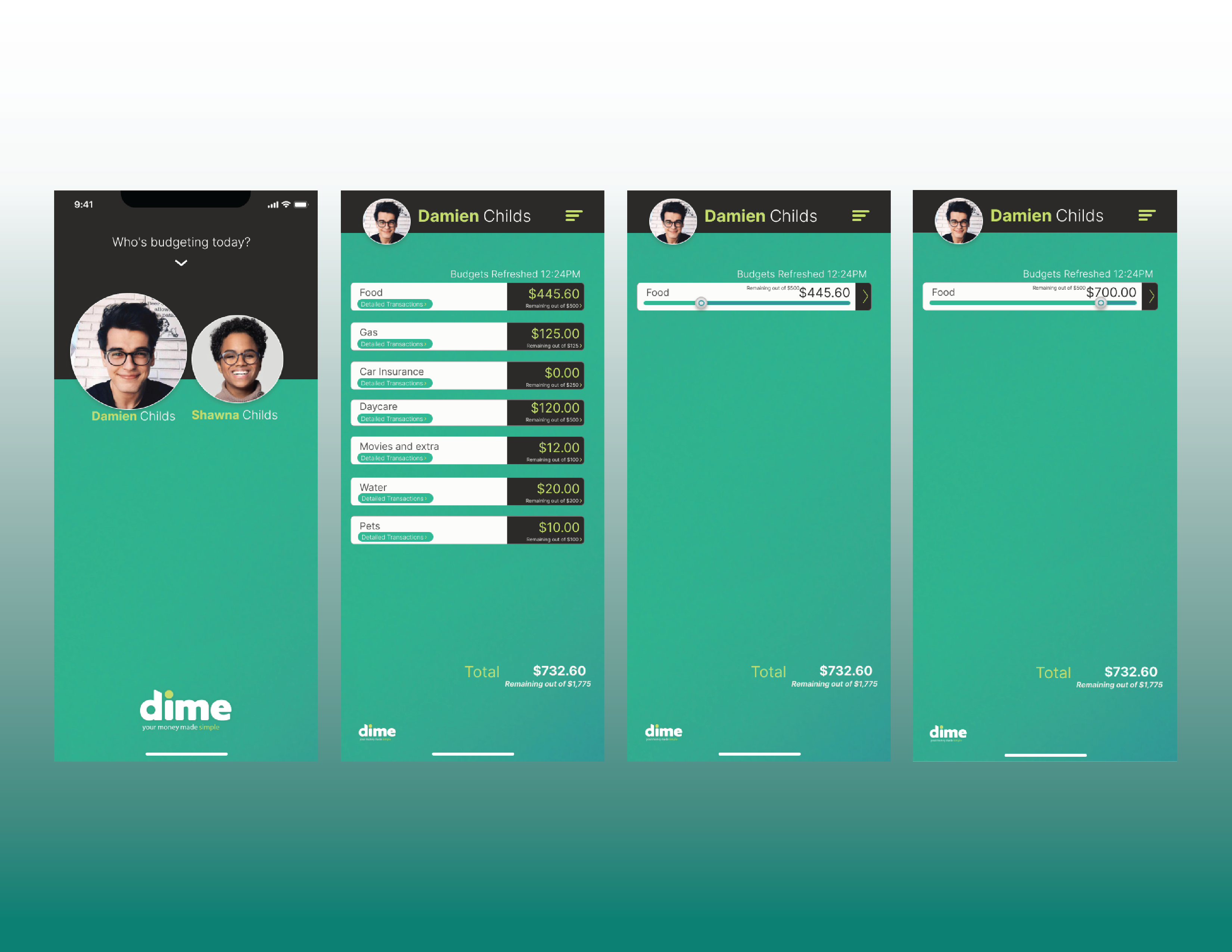
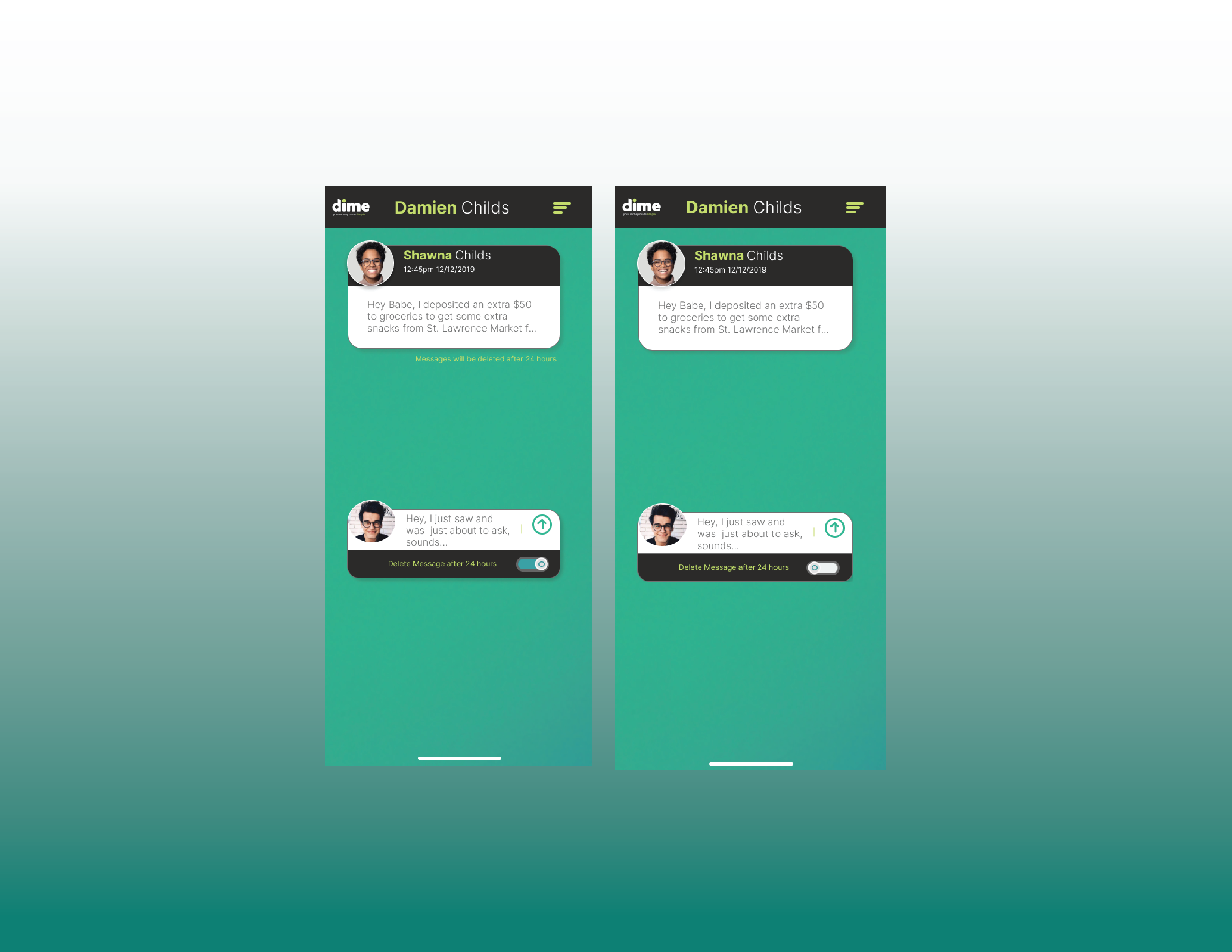
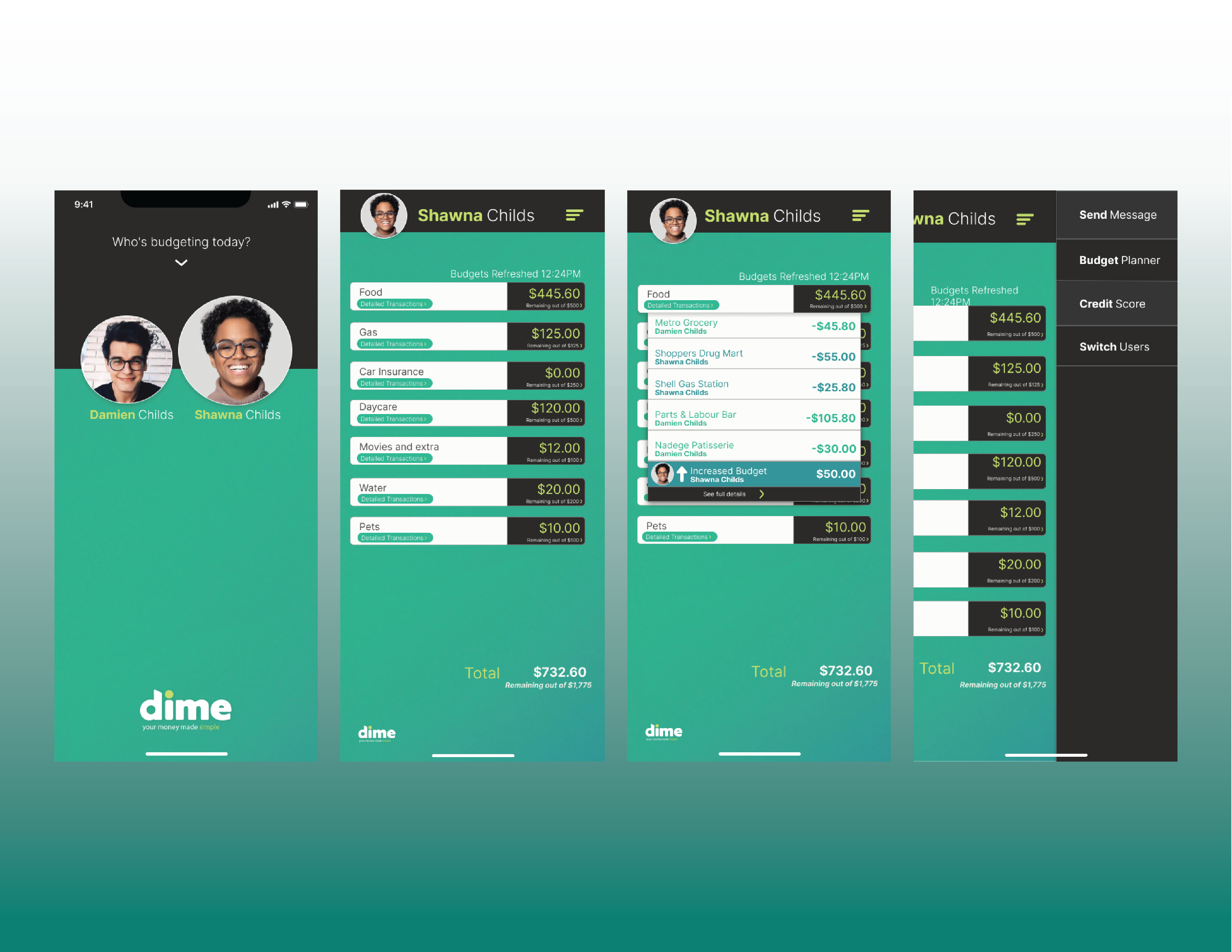
The central question driving the work was: how can two people see the same financial reality from their own perspective, without duplicating data or creating confusion. That led to an identity-first structure, one shared data source, but two distinct views, rather than a generic dashboard. It also uncovered something important: money conversations already happen outside the app, over text or in person. Bringing that communication directly into the product, tied to specific transactions, removes an extra step that often creates friction or misunderstanding.
Key choices included: showing identity selection before any financial data appears (flipping the usual finance-app pattern), designing per-user views of shared information, treating over-budget states as a primary interaction rather than an afterthought, embedding messaging within transaction contexts, and including a message-deletion option to account for the emotional weight that shared money conversations can carry.
Outcome
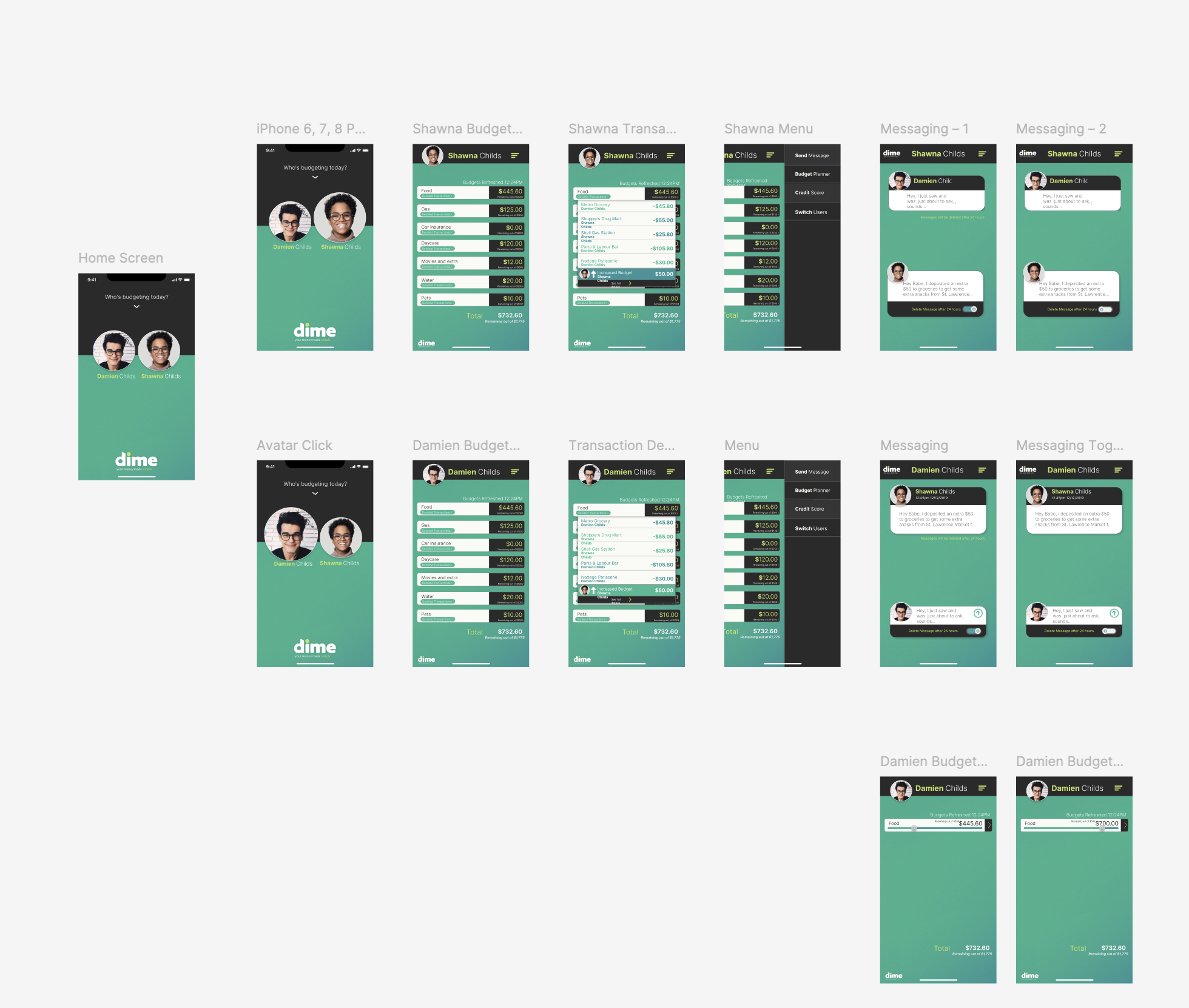
The final deliverable was a fully interactive prototype that shows a clear ability to spot a behavioral gap in an existing market and translate it into a coherent product structure covering core flows, edge cases, and the relational UX considerations that make this space so unique.